That’s right. Another week has passed and here we are. Devblog time!
Our designer Carl has had fun redesigning our essence and magic system. We've reworked many of the units in the game which has affected the line-ups in the factions. So using the essence system, he’s been mapping out the availability for different spells for the different factions. At the same time, he has had to make sure that the flavor of the spells also suits the flavor of the faction. Furthermore, he’s been working on the redesign of the buildings, build orders and how that impacts the spells.
Felix has been doing concept art for Doneria buildings, these two are just a small example of all the new structures that he has tried out designs for.
The UI work for Christian has still been focused on the Battle, and specifically on the player’s interaction with their own troops, enemy troops, and spells. The first pass of all UI-elements has been clarifying all states and high-level UX to be able to work out how the UI should help and guide the player. A basic principle in this work is to only use UI when we really need it and when we can’t communicate the states or guide the player in any other way.
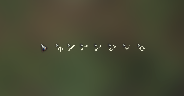
New cursors for combat. Can you guess what they all represent?
Meanwhile, Niklas has been working on the high-ground mechanics. He has implemented damage buffs & nerfs, which relates to where your troops stand on the combat grid. This is a fairly new feature that we hope will bring more depth and tactical choices to combat. Niklas has also started working on how to inspect troops on the battlefield for strategically important information.
A pretty clear example of how our character designe has changed over time: To the left you have our original take of the necromancer and to the right the updated version.
Finally, the art team has mostly focused on the look and feel of the hexagons on the battlefield. Same stuff as last week you say? Why yes. Tricky stuff mixing 3D and pixel art and getting it just right. But it’ll be worth it, for sure!
Until next week, take care!
Please note that this is a devblog. Features and graphics mentioned or displayed above may or may not change during the development process.


